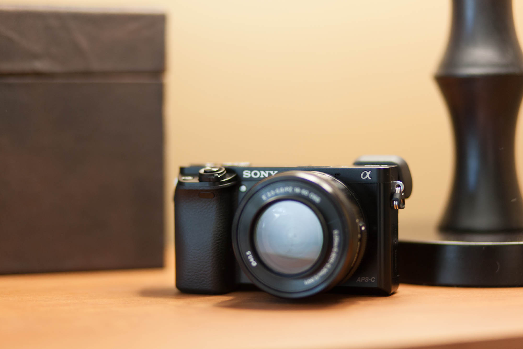
Sony’s latest mirrorless APS-C camera is a remarkably exciting entry into the mirrorless camera market. First, it is the successor to the renowned NEX-7 in the body of the NEX-6. It has all the features and performance I would expect from a mid-range DSLR in a body half the size that enables me to carry it around with me just about anywhere. I can even drop it into the pocket of my jacket—given it has oversized pockets. Sony claims the a6000 has the world’s fastest autofocus of any APS-C sized camera, coming in at 0.06 seconds. In practice, this means that the camera focuses nearly instantly and doesn’t hunt for focus in good lighting.
Now I could go on about why I’m excited about the camera and ramble about its specs, but you can find the specs just about anywhere. In fact, you can find brilliant reviews of this camera from people much more knowledgable and experienced than I am. If you are a professional looking for a professional’s opinion on this camera, I’d encourage you to find another review. Instead, this is a review for the layman, for the amateur like me. This is the first standalone camera I’ve purchased and I’m just beginning to scratch the surface of what it can do. I only have the 16-55mm f3.6-5.6 kit lens, I’m not shooting with a thousand dollar Zeiss lens or an external flash. In fact, I don’t even own a tripod (yet), but I’m getting there. If that sounds anything like you, I’m writing this for you. Thanks for reading.
 Design
The first thing you’ll notice about this camera is that it’s tiny. I had some Sony Cyber-Shot point and shoot camera years ago when I was a kid that was about this size. It weighs about 350 grams with a battery inside of it which is about the weight of three iPhones. The (kit) lens adds some weight to the front but it still feels balanced in the hand. The body is made out of a magnesium alloy on the top and back which feels nice, but not as high quality as the aluminum finish of an iPhone or MacBook.
The front and bottom of the camera are made from some composite that feels just as sturdy, but more plastic-y. The transition between these two materials (on the black version, anyway) is completely seamless. It took me some time to guess that two different materials were utilized in the body of this camera. The hand grip is well textured and grippy. Its contour is nice, but doesn’t dictate the way I hold it. The Sony logo rests on both the front of the device and the rear, under the LCD. I think it should only be present on a single place on the entire body and that’s on the front, not randomly placed beneath the screen. I’ll refrain from reminding you how many Apple logos can be found on the body of an iPhone or MacBook.
The body is not weather resistant, but I’m not sure how important this is in a mirrorless camera that doesn’t have a mirror assembly, discreet PDAF sensor, focus screen, or penta-mirror/viewfinder chamber for dust to enter into. The sensor has a cleaning function and is easy to access if manual cleaning has to be performed. When it comes to rain, (which is a concern for me as I’m about to relocate to Seattle) I’m slightly more concerned about the device’s resilience. Water could get into the exposed hot shoe (which I’ll cover more in a bit), the lens mount, inside the articulated LCD, and in just about any other moving part. It would be nice for Sony to weather seal the a6000, even mildly, against water, but this could negatively impact the compact size the a6000 enjoys.
The buttons on the rear are all well-positioned and each control feels solid. The a6000 lacks the extra dials and buttons of its older sibling, the a7, but is just as customizable. It would be nice to have more buttons and dials available, but considering this camera’s position in Sony’s lineup, I think the number of controls is appropriate. Customizing the functions of the buttons and dials is fun and helps make the camera feel like it’s personalized to my tastes. For beginners like myself, a very helpful selection for one of the buttons is the “In-Camera Guide” option which allows you to tap on the determined button to display a brief description of a setting or menu option in the camera’s interface. The record button is placed somewhat out of reach to prevent accidental presses, although a setting exists to disable this button when the mode dial isn’t turned to movie mode. The flash button is also notable because it is the only mechanical button on the rear of the camera (the lens release button on the front is the only other mechanical button on the camera). It manually releases the shutter, giving me confidence the flash will not fire without my knowledge. I never appreciated how (in auto mode) every DSLR I’ve used would pop up the flash on its own accord, often ruining a shot. The flash button on the a6000 is simple and predictable—if the flash is popped up, it will fire, if it’s nestled in the top of the camera body, it will not fire—period.
On either side of the body are small D-rings for a camera strap. Sony didn’t seem to consider this component at all and it shows. Without a strap, the rings are loud. They alternately smack the sides of the body and click like a metronome as you walk. This camera is light enough for me to want to carry it without a strap, but the loud rings have caused me to keep it on, at least until I buy a camera bag or a wrist strap and tape the rings down with black electrical tape.
On the bottom, a simple tripod mount and access flap for the battery and SD card slot can be found. The flap works like just about any other camera although it’s worth noting that once unlocked, the flap doesn’t spring open like it should. I usually have to pry it open with my fingernail a bit before it springs open. Although the placement for the SD card slot isn’t optimal, it isn’t really a problem because the a6000 has no vertical grip accessory and the battery has its own latch so the camera does not power down when the flap is opened.
The camera has a Multi Interface Shoe for adding a flash, microphone (the a6000, regrettably, does not feature a mic in jack), or other camera accessory via a standardized port. I don’t have anything to use with it, but it’s nice to know I can add on a Speedlight or stereo mic if I get into video. Unfortunately Sony didn’t include a cover for this hot shoe, leaving it looking a little exposed and incomplete. This is another half-witted decision on Sony’s part. On top of this, they don’t seem to sell a cover for the hot shoe, although I found this cover on Amazon that I believe will do the trick. Mistakes like this are forgivable, but break some of my good will toward Sony. This isn’t an inexpensive camera and this inexpensive protective part isn’t even available for purchase from them when it should have been included. (Additionally, the NEX-6 included a hot shoe cover.)
In a similar vein, despite Sony’s site claiming to include a body cover (a cap for the camera when the lens is removed), one is not included. A cap for the back of the kit lens should also be included. Again, these are cheap items to include in the box, but Sony overlooks these simple details. Thankfully, these items can be purchased for about five dollars each on Amazon. 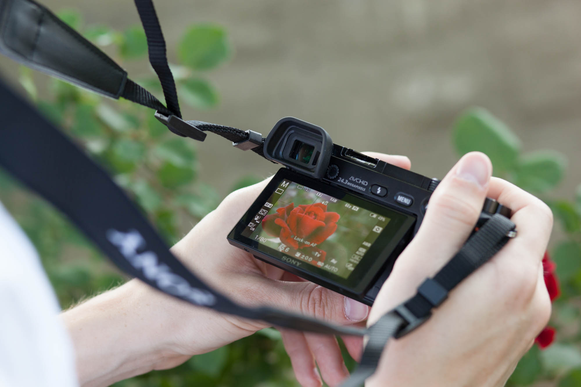
Screens
The 3″ LCD on back of the camera is 16:9 (like your widescreen TV). It fits 16:9 video shot by the camera perfectly and leaves black bars on the left and right sides of photos, which really isn’t bad at all—especially since it means that fewer metadata icons are overlaid on photos during review. The screen has 921k dots, which works out to a higher resolution screen than the iPhone. It doesn’t show though because Sony either has a non-standard sub-pixel layout or their icons and text in software haven’t been optimized well at all. I sometimes even struggle to decide whether a photo is in focus after I’ve taken it and resort to sending it to my phone via the camera’s WiFi or using the electronic viewfinder so I can properly view the photo. The screen can pivot 90° up and 45° down, allowing you to easily shoot close to the ground or above your head. It’s a nice feature, but doesn’t allow the flexibility that some DSLRs like the 70D provide with a flip-out screen that can face towards the front of the camera. Still, it’s a nice feature to have. Lastly, the screen is very prone to glare and isn’t very useful in sunlight. The viewfinder, however, is another story.
The viewfinder on the a6000 is actually an small OLED screen with 1.4k dots, nearly twice the resolution of an iPhone. As you put your eye to the electronic viewfinder (or EVF), the LCD on back turns off and the viewfinder turns on allowing you to easily transition between the two screens and saving battery in the process. Unlike the LCD screen, the viewfinder is pin-sharp and I often use it to review photos. Unlike DSLRs that just give you a view down the lens of the camera and your shutter speed, aperture, battery and light meter, the OLED viewfinder of the a6000 lets you perform all the operations you would from the rear display. It’s incredibly convenient and powerful. More information can be displayed alongside the photo as you shoot and in bright light, you no longer have to squint at the rear LCD to review photos or change settings. This system is excellent for beginners because it previews the effects changing the aperture, shutter speed, ISO and more have on the photo before you take it. Gone are the many test shots you had to take before deciding that you had your settings adjusted properly. That said, the preview isn’t perfectly accurate. It’s just a preview after all, but it gets you 85% of the way there before you even press the shutter button. Advanced features like focus peaking that display the points of your image that are in focus as you frame your shot make using manual focus practical, accurate, and even a little fun. 
Interaction
Sony recently overhauled its menu system making it similar to Canon and Nikon DSLRs’ tabbed menus. The menus are easy to navigate through, although I’m still learning where certain settings are and their groupings don’t always make sense. For example, the “Format” option that will delete all the pictures on your card is six tabs away from the “Delete” selection that allows you to select multiple pictures for deletion. Still, I’m told the previous menu system was abysmal so I’m glad to have an improved one in the a6000. The camera has three dials, two on the top and one on the rear. The rear and right upper dials don’t feature markings indicating a particular function and can be programmed. Ideally, the mode dial would be unmarked like the a6000’s predecessor, the NEX-7. The fact is, I generally don’t change modes, I usually stick to Manual or Shutter Priority. The ability to change what the top left dial does would be preferable to the familiarity of a marked mode dial.
The a6000 allows you to download apps to expand the camera’s functionality. It’s a neat idea that is nearly ruined by poor implementation. To access the PlayMemories store, you first have to connect your camera to a WiFi network. I opted to use my main WiFi network that is password protected but each time I attempted to enter the password I was told that the connection was lost. I was able to join my unprotected guest network without further trouble and joined the main network selection menu later via the menu rather than the PlayMemories browser’s built-in WiFi selection tool. Why two different keyboard and WiFi network selection interfaces are included is beyond me. Once in the store I saw that the Smart Remote App had an update available. I was forced to sign in to a Sony Entertainment Network account. Luckily, I had created one for my PlayStation and sign in was as painless as it could be on the internet browser of a touchscreen-less camera. Note: there is no 1Password app available on the PlayMemories store. After updating the Smart Remote App, I browsed other applications but most required purchase and didn’t look particularly compelling for the price (available apps are currently five or ten dollars).
Playing around with the Smart Remote App was particularly exciting. With the PlayMemories app installed on my iPhone, I was able to tap to focus and control the shutter remotely from my phone, opening a whole new realm of possibilities for using this camera and removing any qualms I had about not having a flip-out LCD on the back of the camera. The refresh rate wasn’t perfect and there was an expectable amount of delay, but it felt powerful and modern. Every camera on the market today should be able to connect to a smartphone.
Hours later though, I revisited the store and found that I had to sign in to my Sony account again via the browser that reminds me of my AT&T Quickfire. The store does not keep you logged in, forcing you to retype your password to so much as browse other apps. I closed the store right then. That’s ridiculous and I hope this is rectified in a software update. To be clear, this isn’t required for apps you have downloaded, only for browsing or purchasing new ones. 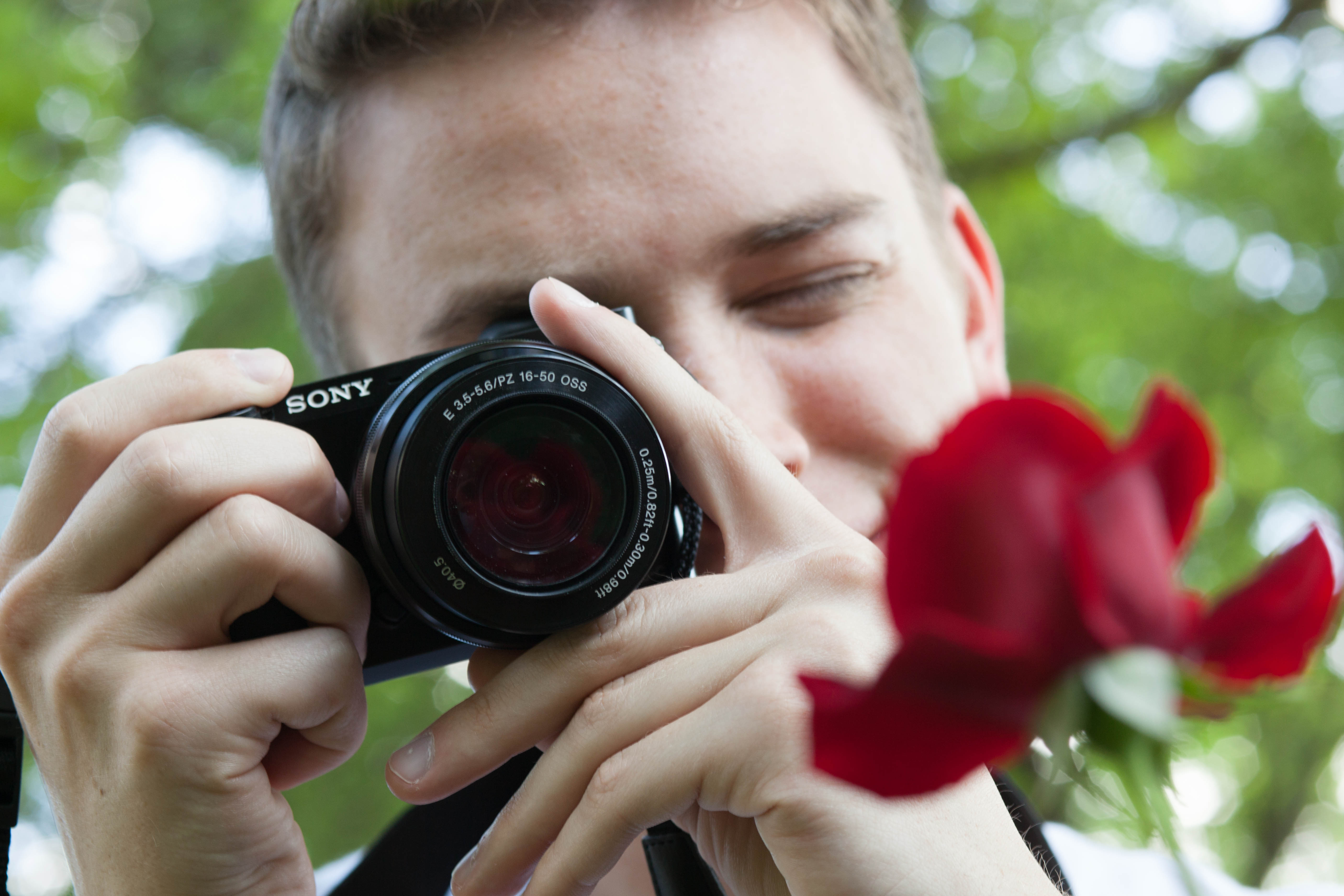
Performance
Like I’ve mentioned, I’m an amateur or an enthusiast—somewhere in that range. I know my way around a camera easily but I probably can’t push it to the very edge of its potential. I’ve taken the camera almost everywhere with me for a couple weeks. Through light-painting, action photography, portraits, and landscapes, I’ve tried to put this camera and its lens through a variety of settings and styles of photography. This is a gallery of samples from the past month. It likely doesn’t do the camera justice, but hopefully this will serve to demonstrate what an amateur can accomplish with this camera. These photos may have seen lens corrections and light adjustments in Lightroom, but little else, and were exported as JPEGs at 60% quality.
While the pictures speak for themselves for the most part, I’d like to note a few other important points on performance. The kit lens is fine. It’s flexible and small but it does not feature high-quailty optics. The corners of photos are heavily vignetted at short focal lengths and barrel distortion is evident on both ends of the focal length range. This lens was designed with lens correction post-processing in mind. JPEG images shot on the camera appear to be corrected on the device as do thumbnails for RAW files, but if you export RAW files you will notice the distortion readily. This may or many not be a problem depending on your workflow, for me it’s painless to apply lens corrections in Lightroom after importing new photos.
The camera’s start up time is about a second and a half—quick, but not really notable. While shots are being written to the card, the drive mode cannot be changed which doesn’t make sense to me. On that topic, you’ll want a fast SD card like the one The Wirecutter recommends if you plan on fully utilizing this camera’s ability to shoot a whopping 11 frames per second.
Dynamic range is excellent on this camera and the DxO Mark results confirm this. On my iPhone, I use the HDR option almost constantly. (For the unfamiliar: a quick explanation of what HDR means.) With the a6000, however, I find that bracketing exposures is superfluous, especially considering that I shoot in RAW. Simply put, this little sensor is powerful and you’ll be more likely to get the shot you want, even in varied lighting situations.
In regards to battery life, the a6000’s 1080mAh battery is sufficient for me. It is rated for 420 shots via the LCD—less than many other cameras, but plenty for me (by way of comparison, the Canon 70D gets 1,300 shots via its optical viewfinder and 230 via its LCD). Additional batteries can be purchased for about $30 on Amazon, a reasonable price.
Conclusion
The a6000 exceeds my expectations in a mirrorless camera because it meets the standard I would set for a DSLR. It stands toe-to-toe in features and performance, actually besting the 70D in many regards. The attention to detail that Sony has paid makes this a solid enthusiast camera, in my opinion. I have some small gripes, but nothing that impairs me from using the camera or makes me regret my purchase in any way.
One downside worth noting is that other, especially those who have already invested in a DSLR, don’t seem to think that a device of such size could be comparable to a formidably-sized DSLR—a disposition commonly known as “big camera syndrome.” This shouldn’t be of particular concern though; the benefits of a smaller camera far outweigh the temporary perception issue users of compact system cameras face. The a6000 packs the performance of the enthusiast-oriented Canon 70D in a package a fraction of the size.
Many people like to point out Fujifilm’s X-T1 as a similarly remarkable entry into the mirrorless camera market and, while I agree that it is a remarkable device, I don’t think that it is as outstanding as the a6000. First, the X-T1 is $850 more expensive at $1500 for the body alone, has a larger volume, and is a good deal heavier than the a6000. To me, this correlates to a decrease in usage—the larger and heavier the camera, the less I’ll opt to take it with me. Truly, this camera is priced as a competitor to the a7, but doesn’t have the advantage of a full-frame sensor. Also, while the X-T1 excels in many technological aspects such as the viewfinder, remote app, and weather resistance (all of which I would like to see addressed in Sony’s lineup at some point), it relies heavily on physical controls which aren’t as adaptable and customizable as the a6000’s. Most importantly, it seems that the philosophy that drives the style of the X-T1 is one I simply don’t agree with. The X-T1 tries to pay homage to cameras of an older generation in function as in design. I don’t mind a camera that looks a little retro, but when a camera seems to be developed upon the idea that the technological advances made in user interfaces with the advent of smartphones and tablets don’t apply to cameras, I disagree completely. I believe that all cameras, whether high-end professional or point and shoot, should be as easy to use as a smartphone. It’s worth noting that the X-T1 is not the only Fujifilm camera that demonstrates this spirit, in fact all of Fuji’s X-series cameras are designed with these principles. I reference the X-T1 exclusively because it has garnered much attention lately and is representative of Fujifilm’s best. Yes, professionals need the ability to quickly change settings without having to dive into on-screen menus, but the surface of the camera doesn’t have to be heaped with knobs and switches, buttons and spinners. Basically, I think cameras should begin to look more like the Leica T than this, though perhaps without eschewing physical controls quite so ambitiously. But before this becomes a manifesto concerning my ideal camera, I’ll finish this thought by saying that while the X-T1 is a great entry into the mirrorless market, I don’t consider it particularly competitive with Sony’s better priced and spec’d products and I hope Fujifilm keeps making exceptional cameras because competition will just force others to improve.
The a6000 is the best camera body for me at this time. I gave which system I chose quite a bit of thought and Sony continues to impress me on all fronts with their imaging products. Sony’s Alpha system isn’t the most popular, but the company is making it clear that they are going to continue to invest in its development. I’m particularly drawn to the fact that the camera has an APS-C sensor format while the E-mount system works with lenses designed for both APS-C and full-frame formats. This allows me to purchase a relatively inexpensive body and kit lens but then begin acquiring full-frame glass for an eventual transition to a full-frame body. The a6000 is a step forward for photography. It’s a competitive full-fledged camera with a growing lens ecosystem in a light and small body. If you have any questions about the a6000, please mention me on Twitter or App.net—I’d love to chat about this device or just your experiences with photography in general.
Special thanks to Derek Duncan for helping me take photos for this post. All photos of the Sony a6000 were taken on a Canon 5D Mark II.
 I’m excited to see what they will unveil. The rumor mill has pinned down and iPhone 5S with moderate upgrades perhaps including a fingerprint sensor and an iPhone 5C with a plastic body that sells cheaper than the traditional iPhone. Expect the release date for iOS 7 to be unveiled then as well. I’m not expecting any iPad announcements at this event, but an updated MacBook Pro with Retina Display sporting Intel’s Haswell chips would be a welcome addition to the products unveiled next week.