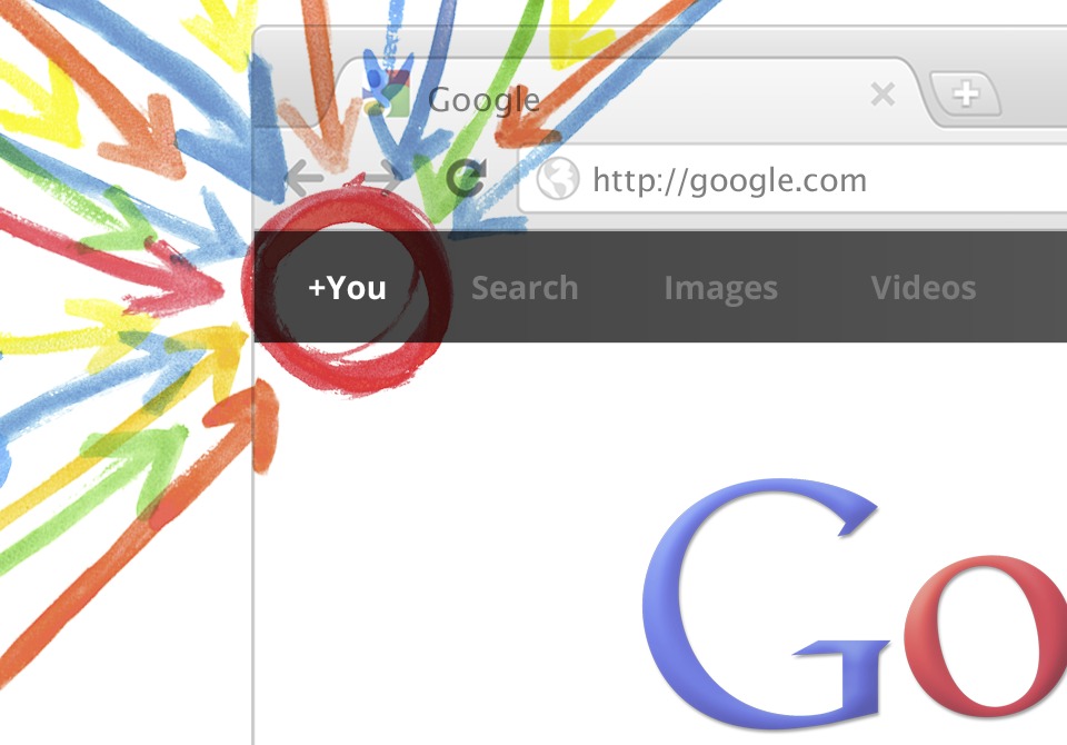
 Google’s newest move into social, Google+, came with a remarkably well designed interface. Although there are still plenty of gripes about the social network itself I am going to pay attention to what Google is doing here with their interface. Google is known for their utilitarian interfaces and that is what people have come to expect from Google. However, with Google+, they also previewed a new Gmail interface that is similarly well designed (in my opinion). Google also launched a sleek black bar at the top of all Google properties, you know the on it has links to most of Google’s services, and called it the Sandbar. I have never been much of a fan of Google’s design choices, until now.
Google has wised up and realized that one way it has let things slip in its battle against Apple is in design. Apple is known for its well thought-out interfaces and minimalist design. Google at some point realized that they needed to compete with Apple on this (If they were competing before they just sucked at it). I feel now Google has finally grown up and noticed that function is not to be enjoyed without beauty. I believe that we will now see Google go though all its services and spruce them up the way it has with Gmail. The design also complements the stock Android Gingerbread interface much in the same way that iOS complements Lion and Windows Phone 7 complements Windows 8. Not many will notice the similarities between Google’s new look and Android, partly because of Android skins and also because they are less pronounced than their competitors’ similarities.
All said, I believe this is a turning point for Google, a well-received social strategy and a design that people will notice looks nice. Both of these things will play a role in Google’s future developments.